The brief
Thrivebox was a proposed idea for a vegan food subscription box service. As vegan food is often misconceived as expensive or inaccessible, Thrivebox wanted to give everyone the opportunity to sample delicious plant-based treats at an affordable price. The Thrivebox team knew that to stand above their competitors, they needed branding that set them apart from other businesses.
The process
To begin creating the branding concepts for Thrivebox, I needed to determine what exactly made subscription boxes so popular. While they are an extra monthly cost, the subscription price is often dwarfed by the excitement of receiving a parcel in the post, as well as the allure of never knowing which products you’ll end up with. They are a pleasant surprise – a small treat that the consumer doesn’t need to feel guilty for purchasing, as the trip to the store or entering card information for each and every purchase is removed from the process. They simply gift themselves once, and don’t need to worry about it again until it’s time to renew their subscription.
As well as incorporating the exciting ‘gift’ element to the branding, I needed to consider what set Thrivebox apart from other food subscription box services: veganism. A vegan food subscription box may not only be purchased by vegans, but also gifted to non-vegans who wish to give plant-based food a try, or who are gradually transitioning to veganism. Therefore, the branding needed to be enticing to anyone who would set eyes on one of the subscription boxes, and would need to inspire people of all diets and lifestyles to want to see (and taste) what was inside.
Ordering products online, although increasingly popular with every given year, can still seem quite daunting to people who are used to buying things in store. This meant that the tone of voice of Thrivebox needed to be friendly, familiar and inviting; something that made online subscriptions look simple and beneficial to potential consumers who were inexperienced in the concept.
The solution
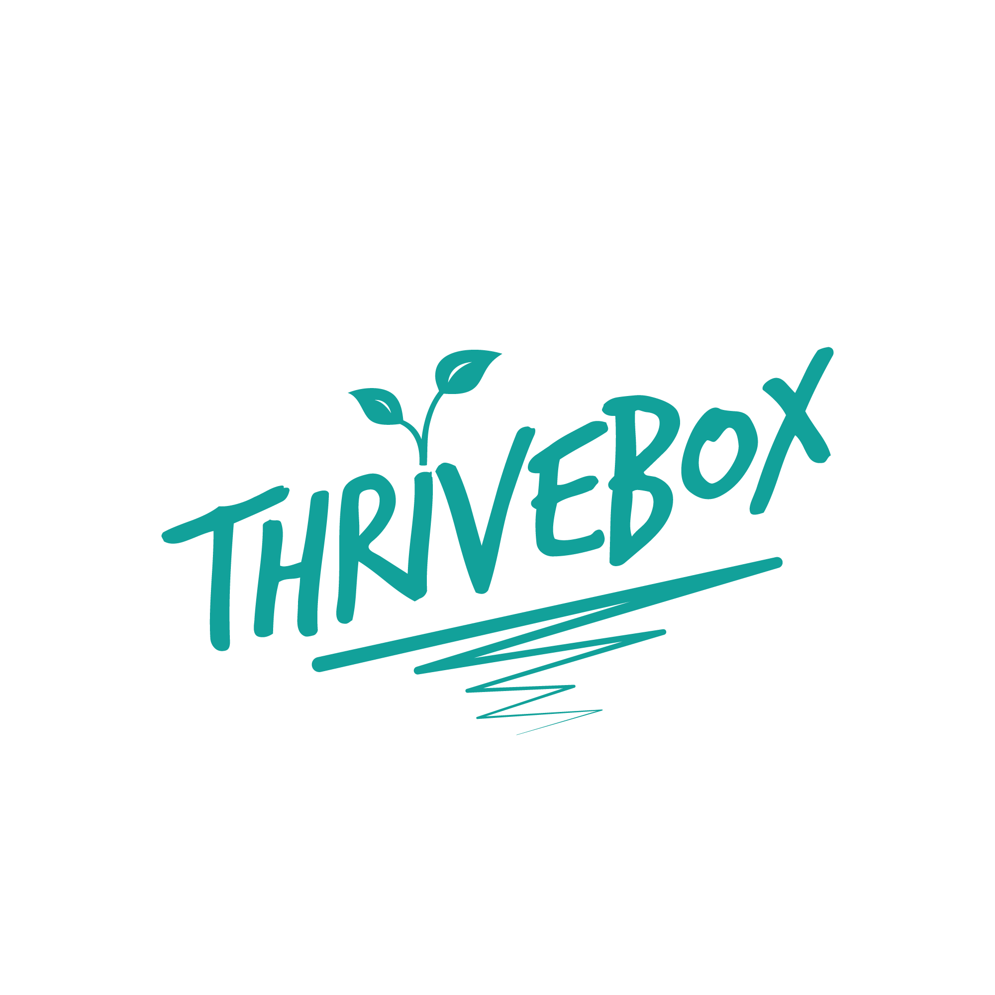
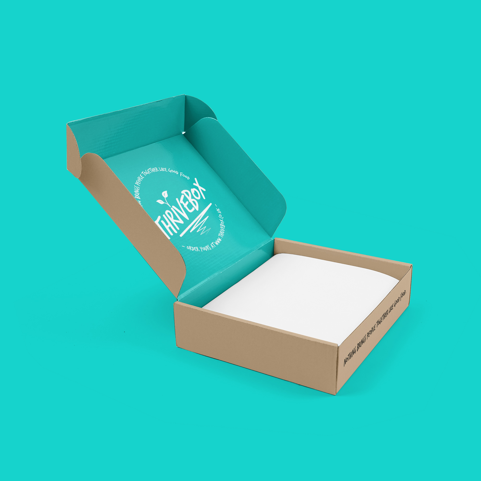
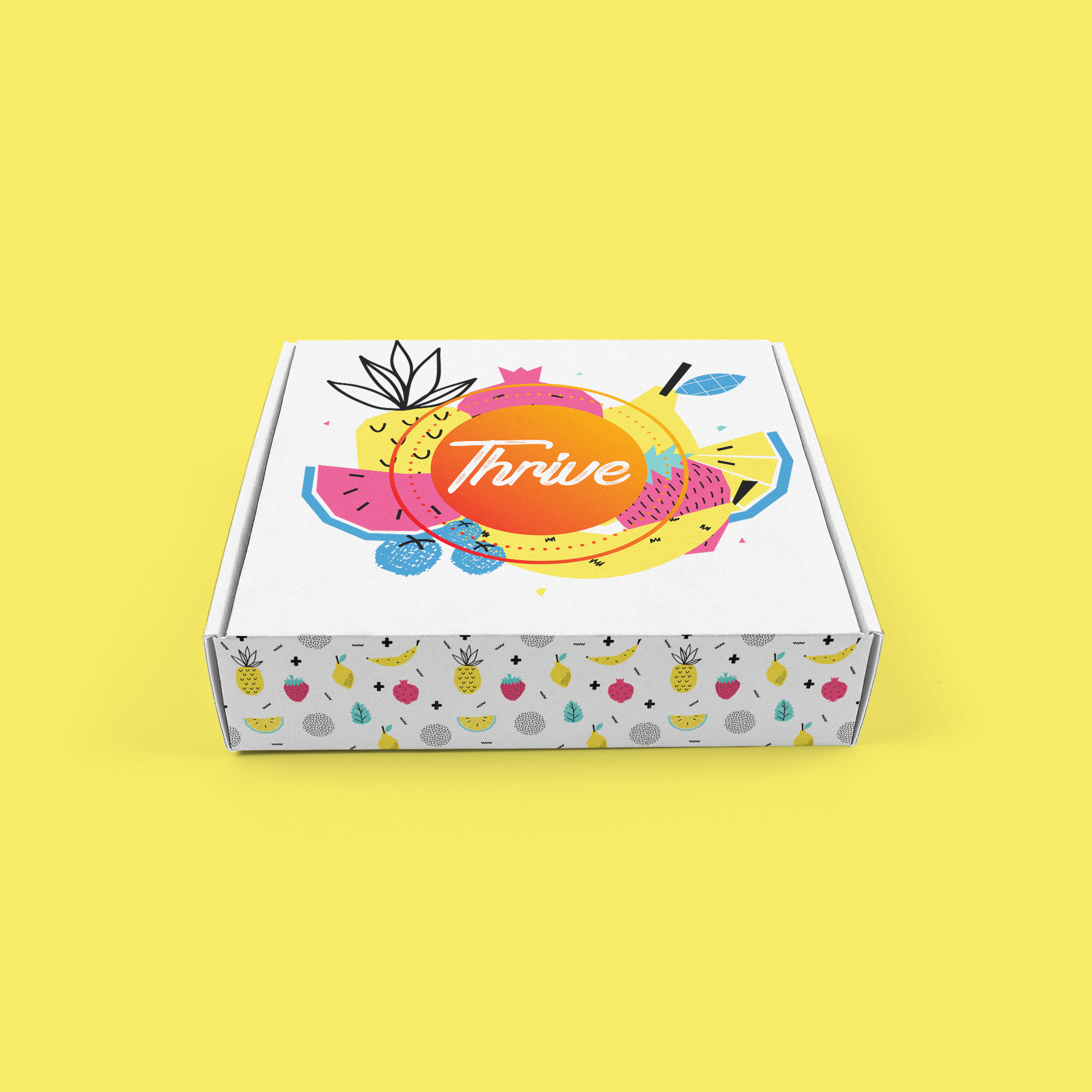
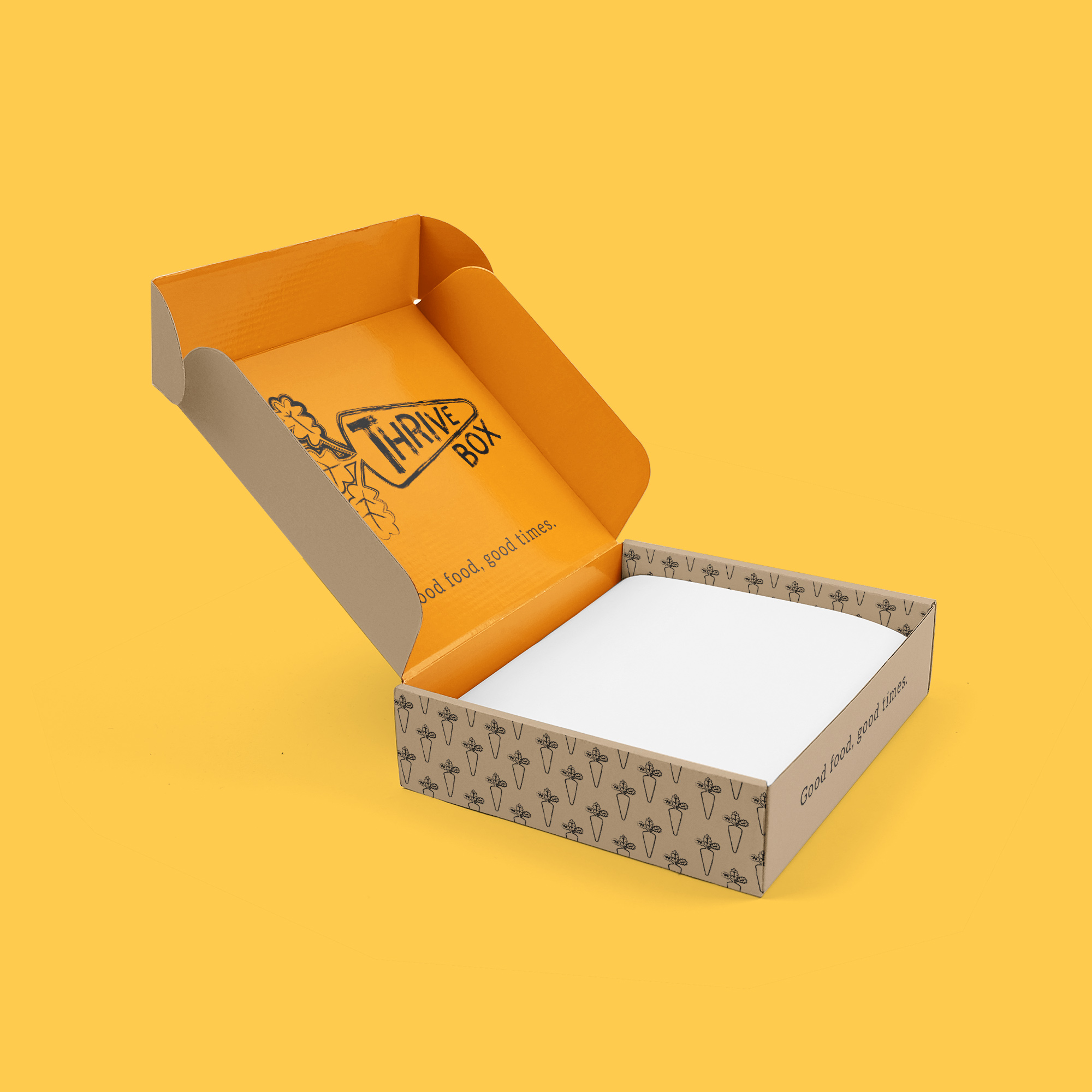
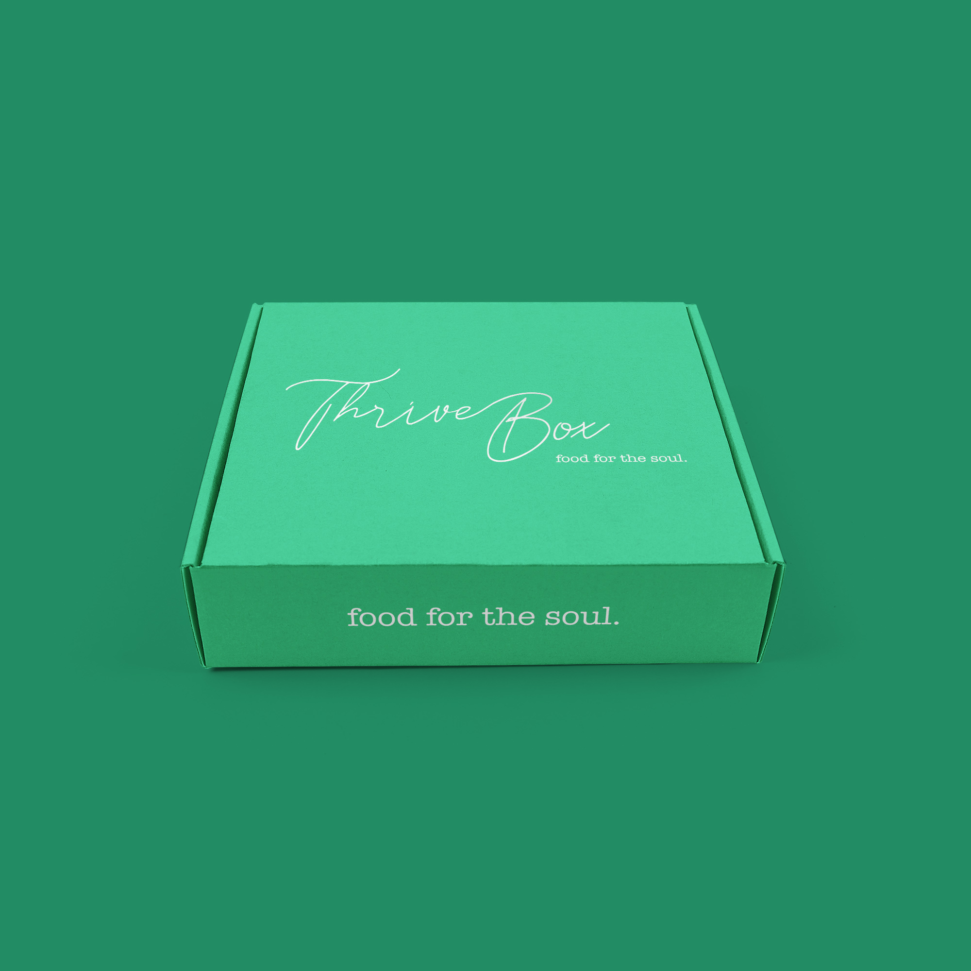
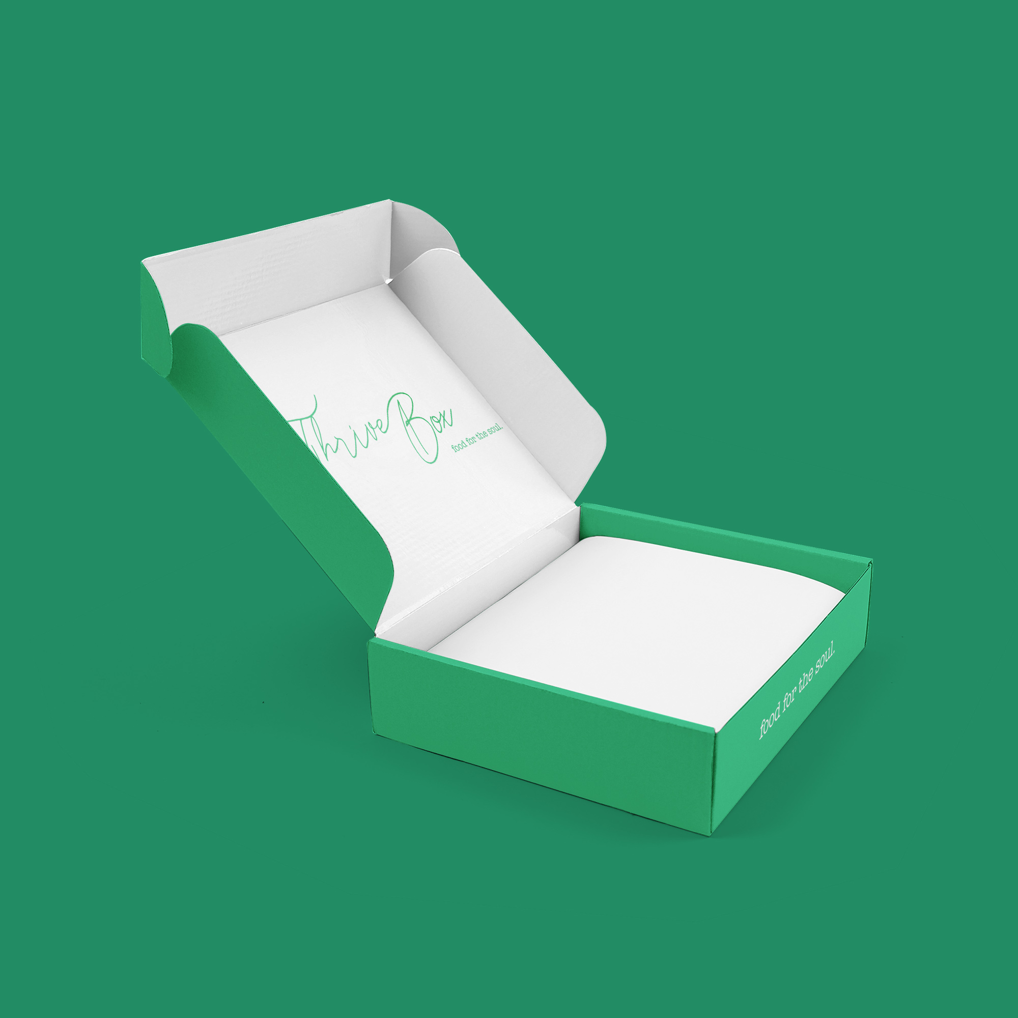
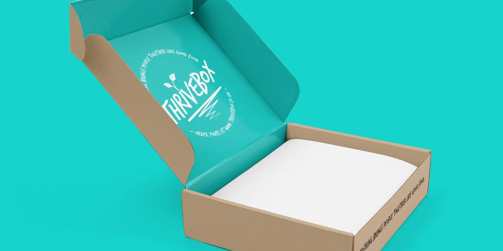
I presented the Thrivebox team with 4 individual branding concepts, presented directly on a cardboard box. Each concept, while very different to one another, included the same core elements I felt were important to get across. They each made use of energetic, rich, fresh colours; whether it be on the logo itself or on the inside of the box, to contribute to the excitement the Thrivebox team wanted its consumers to feel upon receiving their first subscription box. Each design comprised of a ‘handwritten’ typeface, to give the friendly, familiar feel to the brand. Finally, alongside each concept came a slogan – a saying that accurately summed up the team’s mission statement. ‘Good food, good times‘, ‘Nothing brings people together like good food‘, and ‘food for the soul‘ each helped encapsulate the relaxed tone of voice of the brand, ensuring the product was presented as something that, above all, was meant to be enjoyed.