The brief
Razor Edge Media was a full service digital marketing agency, founded in May 2013. When they employed me as their first and only in-house graphic designer, I was tasked with completely overhauling the design of their website. They needed a new, fresh face to the company that would present them as a trustworthy, professional and knowledgeable agency that was well-versed in the services they offered.
The process
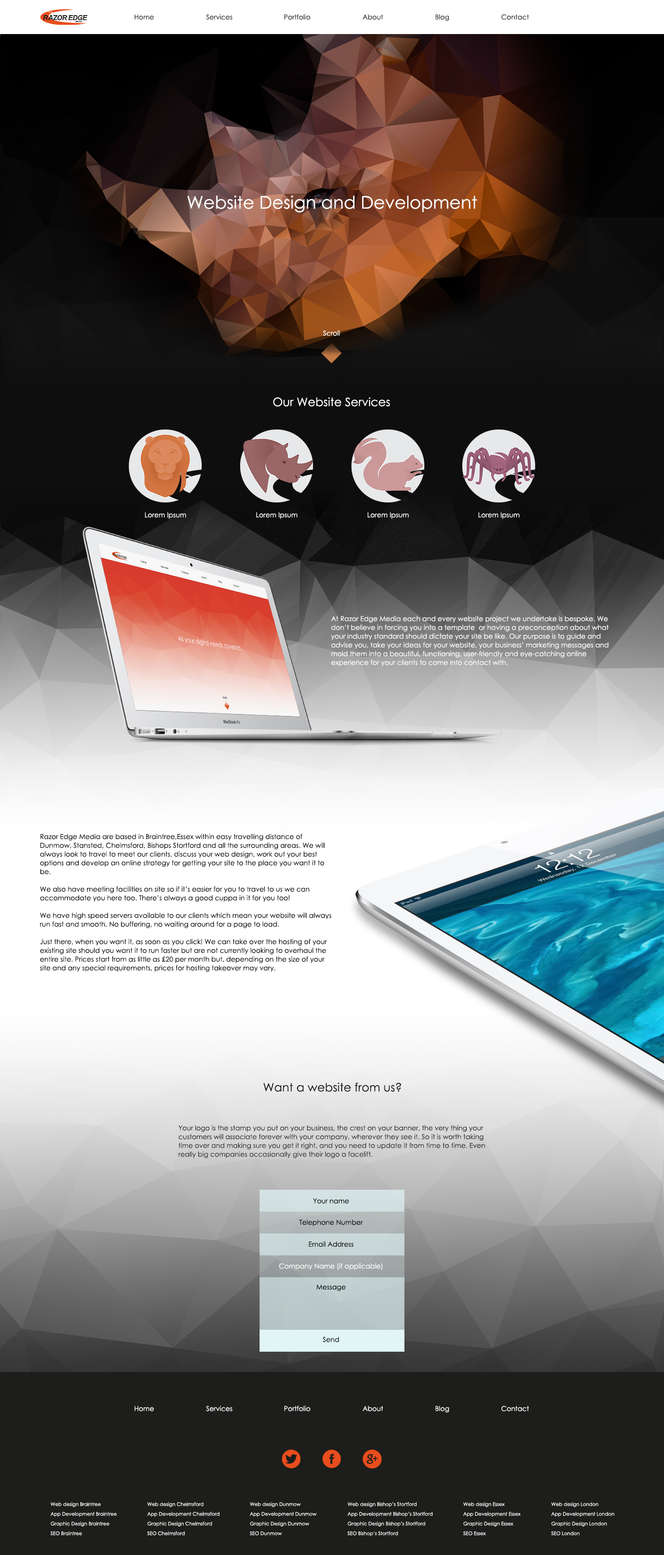
Designing the Razor Edge Media website started with understanding the ideals and beliefs of the business. REM had a large focus on customer service, meaning that the website, above all, needed to be user-friendly and inviting to existing and potential clients. With a digital agency, a lot of the services offered can be new and unfamiliar to everyday clients, and if these are not presented in a way that is clear and simple to understand, it can leave people feeling out of their depth or alienated. As REM targeted small-to-medium sized businesses, it was of paramount importance that we avoided this with the new website design.
This is why I designed a series of animal icons which were each designated to one of the many services Razor Edge Media provided. Each icon was designed using Adobe Illustrator, and made use of energetic, saturated colour and soft shading to add a touch of friendliness and familiarity to the services. It also helped make each service a bit more recognisable to clients who were unfamiliar with technical jargon.
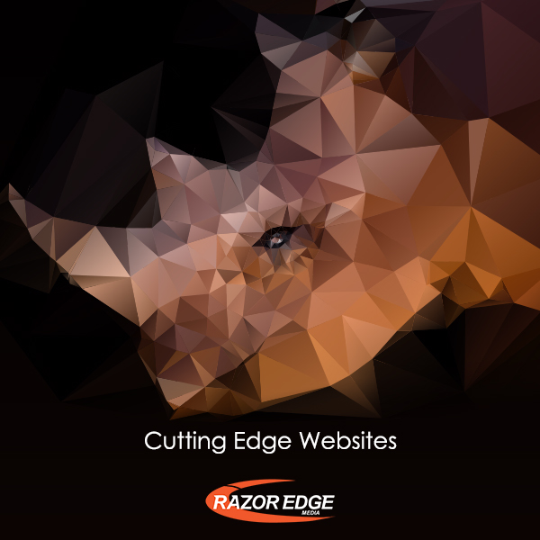
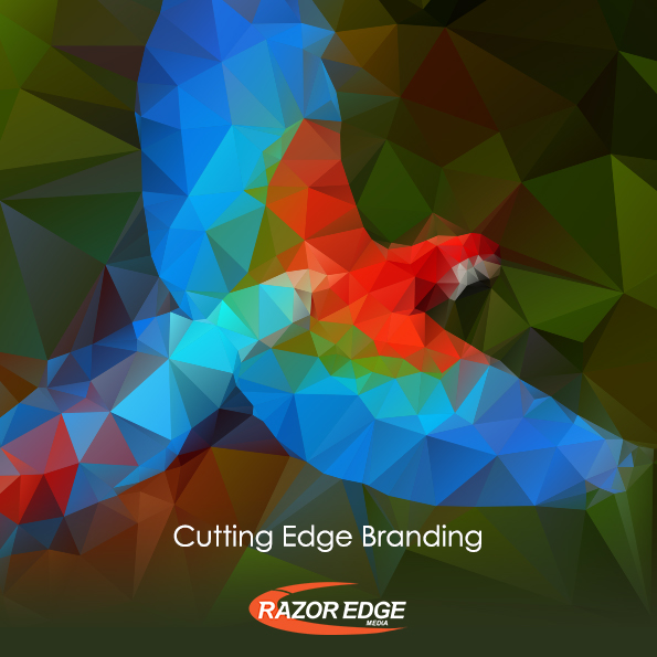
For the rest of the website, I placed a focus on rich colour and geometric shape. The combination of the two, as well as making good use of white space, would help give a clean and crisp finish to the site.
The solution
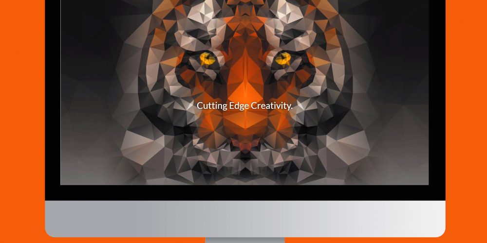
The finished Razor Edge Media website combined unique style with seamless functionality. The use of the icons made the website all the more easier to navigate, and the geometric patterns used throughout helped make a memorable impression on potential clients. The highlight of the site was the embedded video of a stunning geometric tiger featured at the top of the home page, whose colour gradually increased and decreased in saturation!
I also created a series of promotional social media graphics to help advertise the launch of the new website design.