The brief
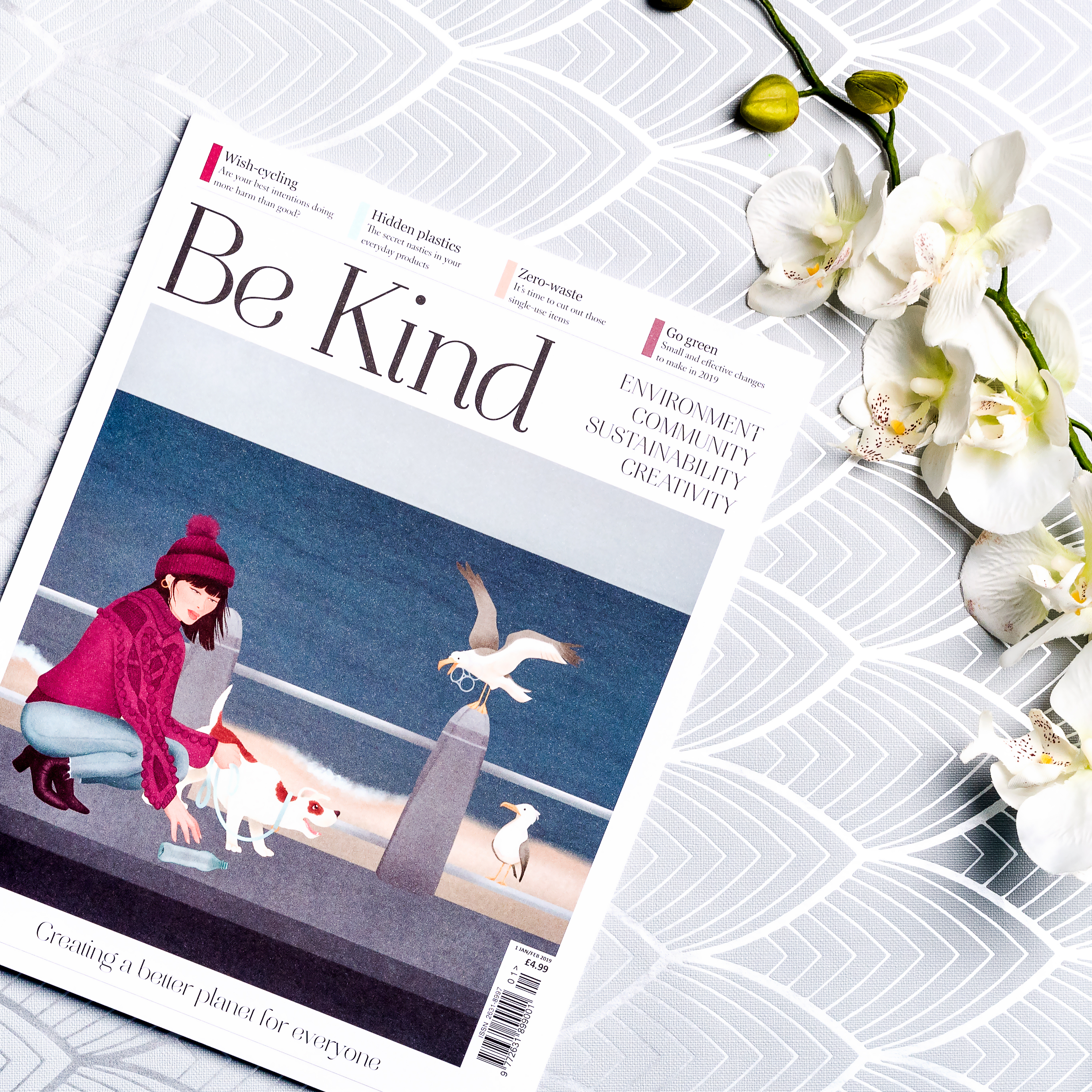
Be Kind Magazine is a publication which aims to make the world a better place. Born in late 2018, the magazine covers a variety of environmental and social issues, from plastic pollution and animal welfare, to community projects and upcycling. The team at Be Kind wanted to inspire their everyday readers to make small, manageable changes to their daily routines that benefit the planet, which is why they decided that they needed a front cover that would immediately resonate with their target audience. After looking at competitor magazines, Be Kind tasked me with illustrating one-of-a-kind front covers that would really help the magazine stand out on the supermarket shelves.
The process
We began by determining the magazine’s readership. Be Kind Magazine aspired to target a youthful, environmentally-conscious audience that wanted to find simple ways to make a difference. They concluded that women made up the majority of their intended readership, and they also needed to consider that, with magazines being a luxury item, Be Kind needed to be presented in a way that made it feel just as worthy a purchase as a hardback book.
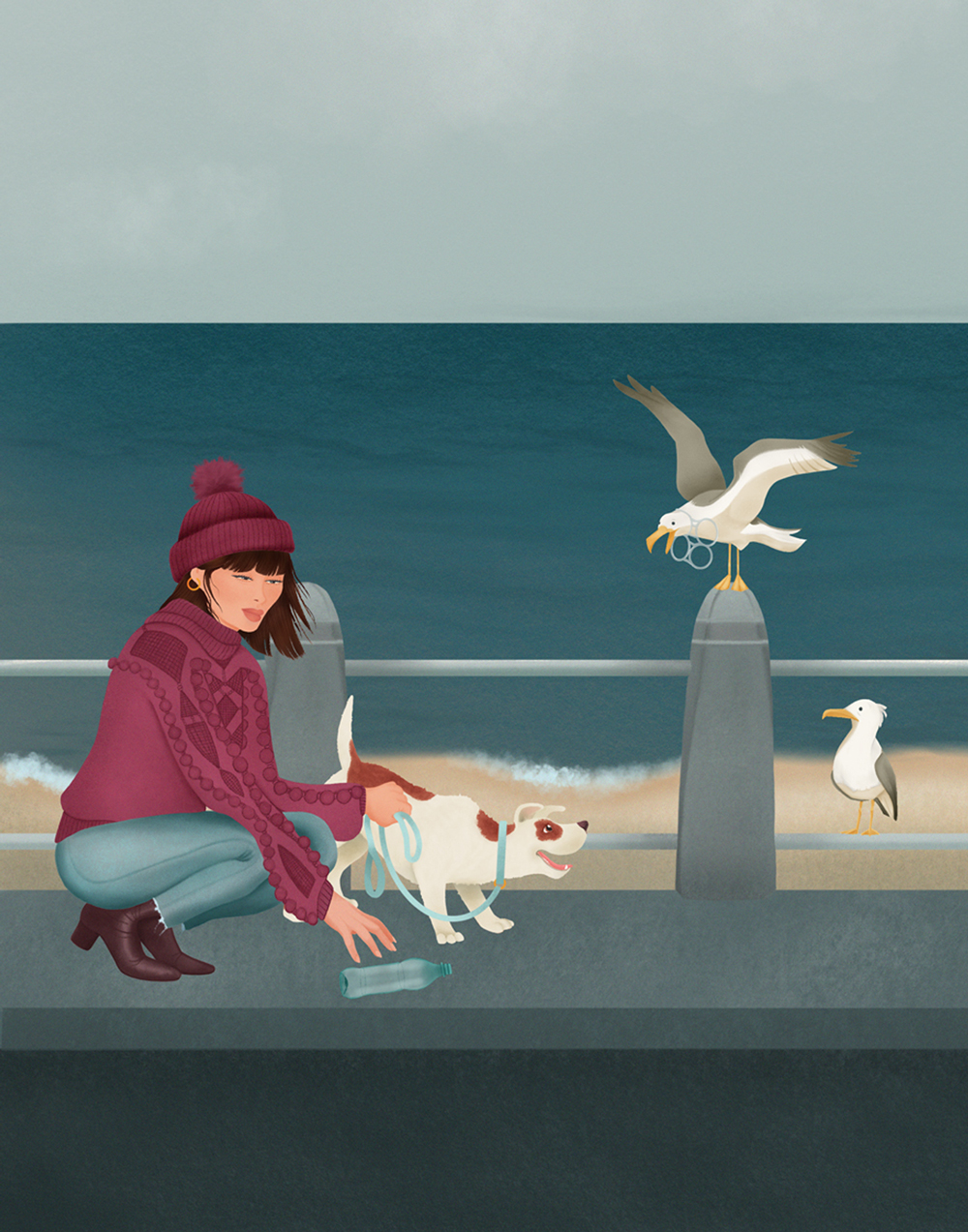
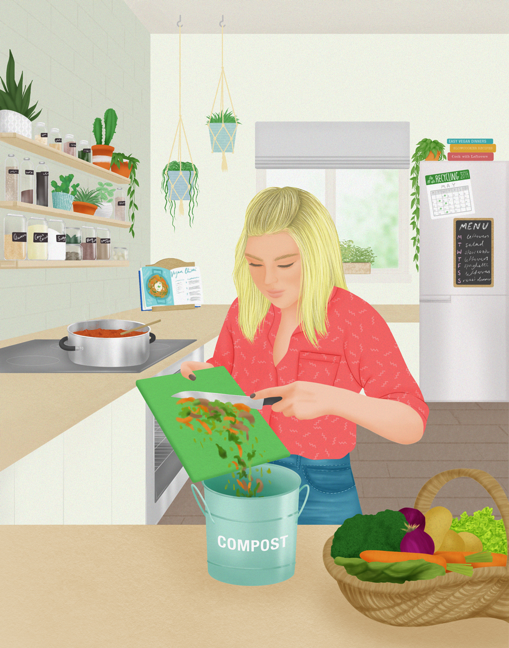
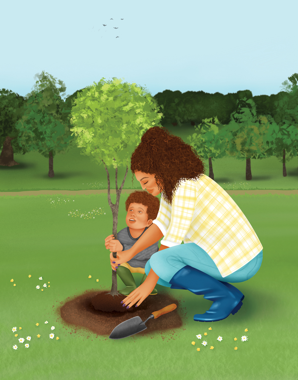
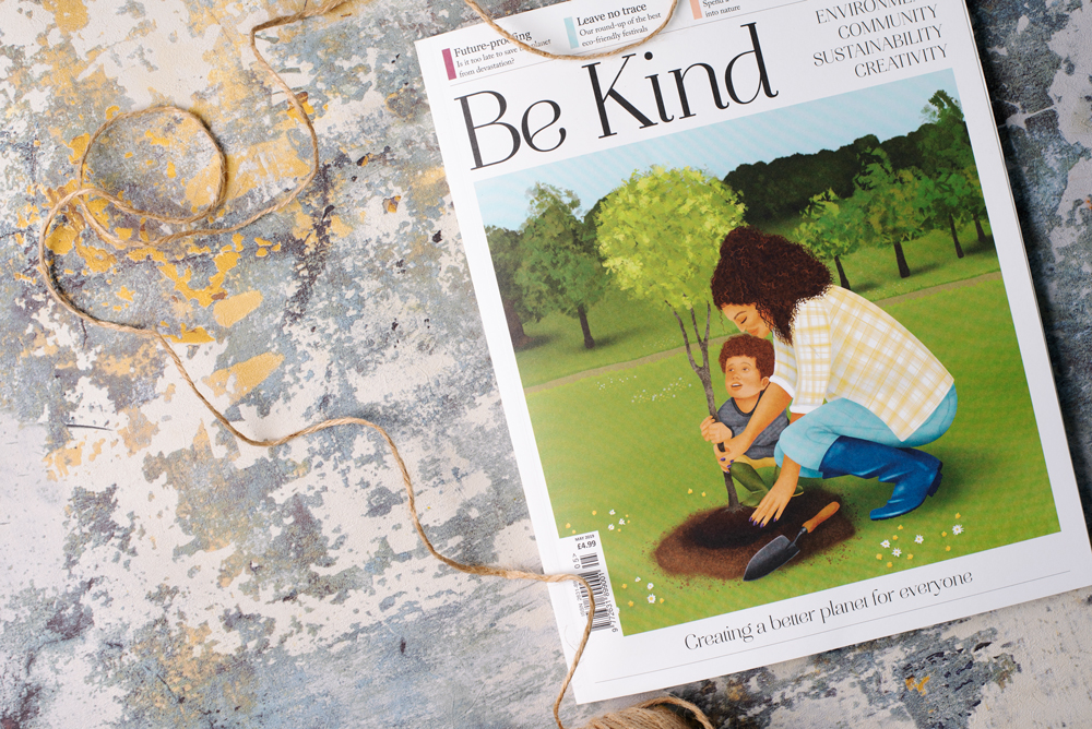
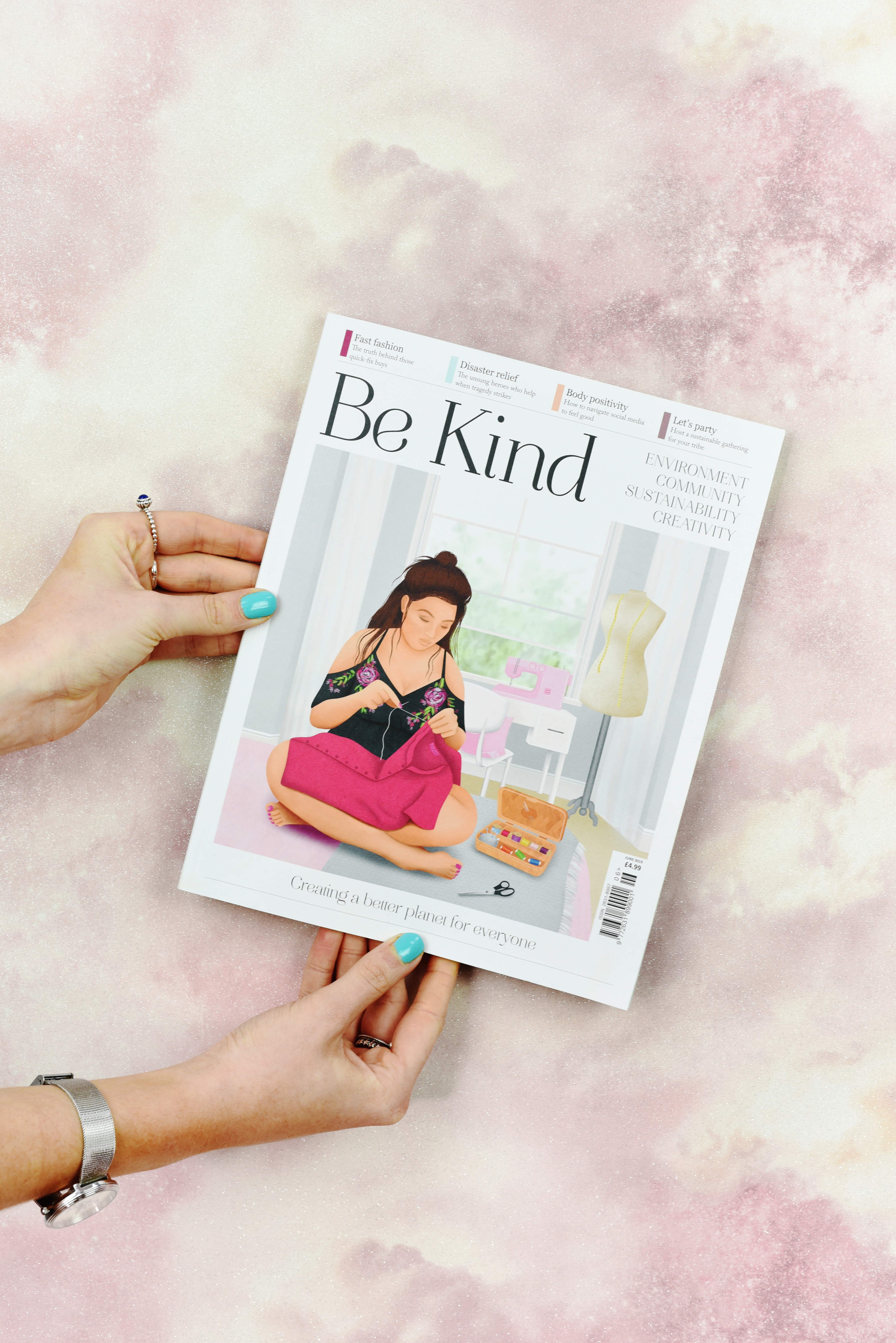
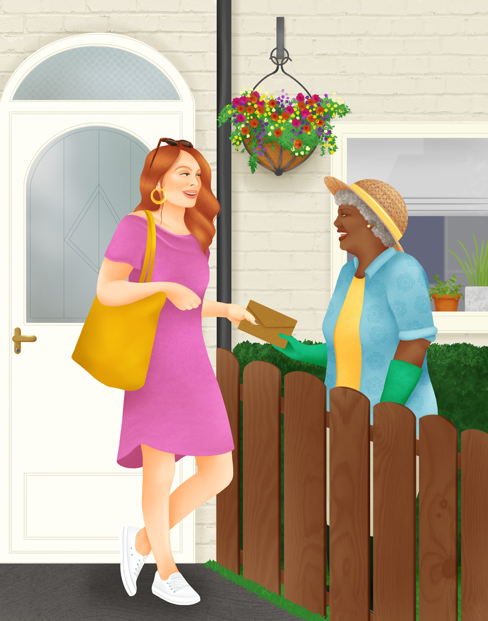
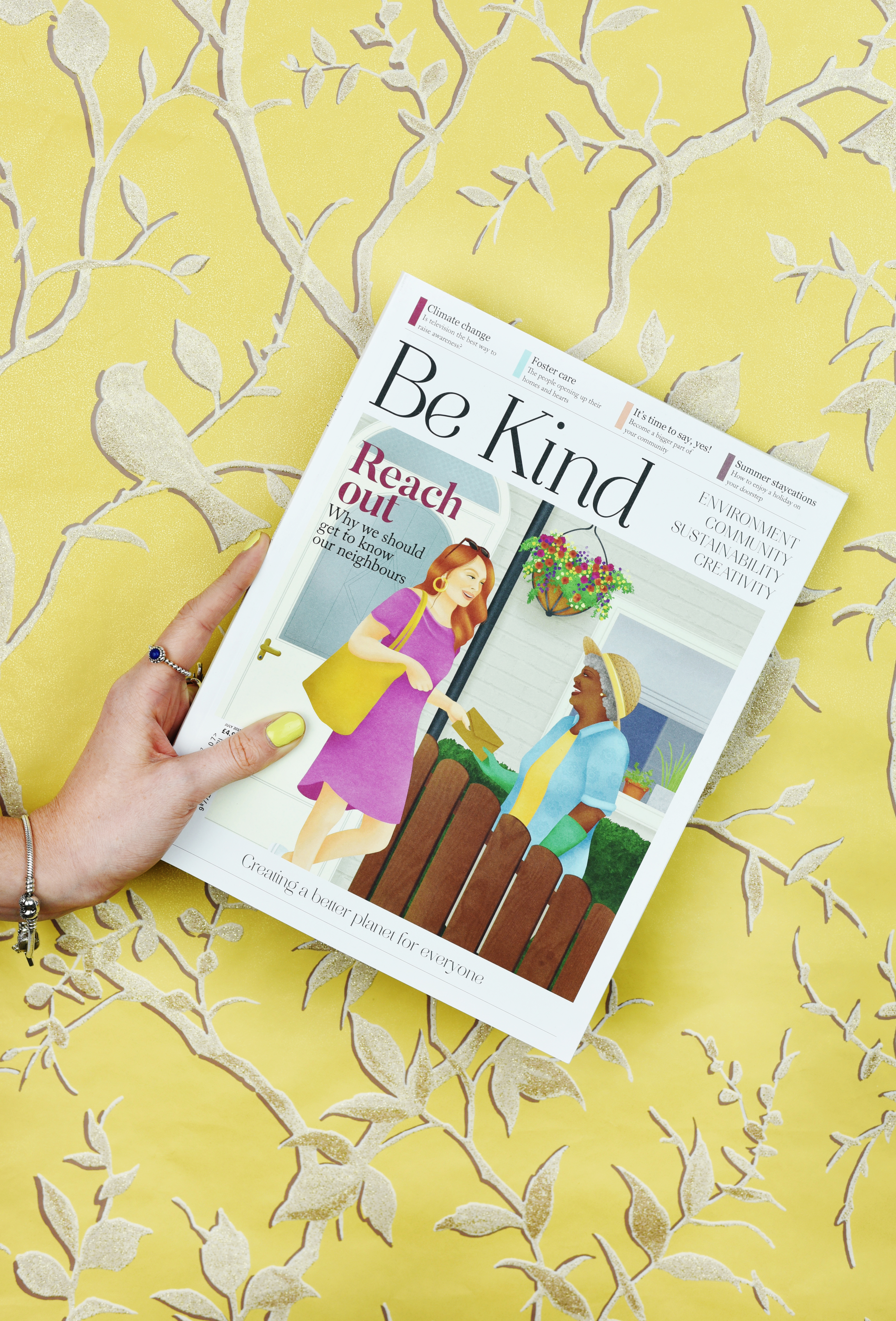
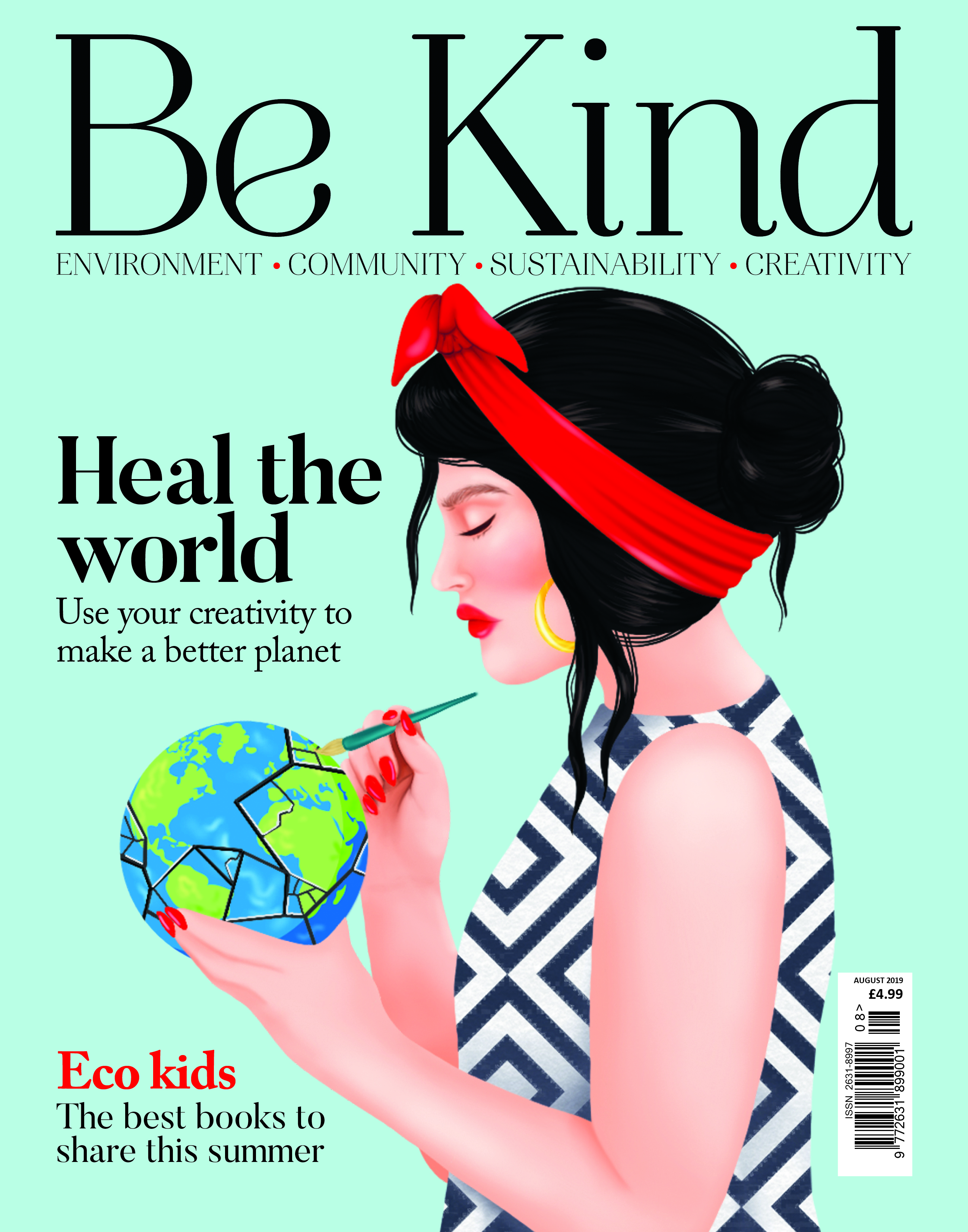
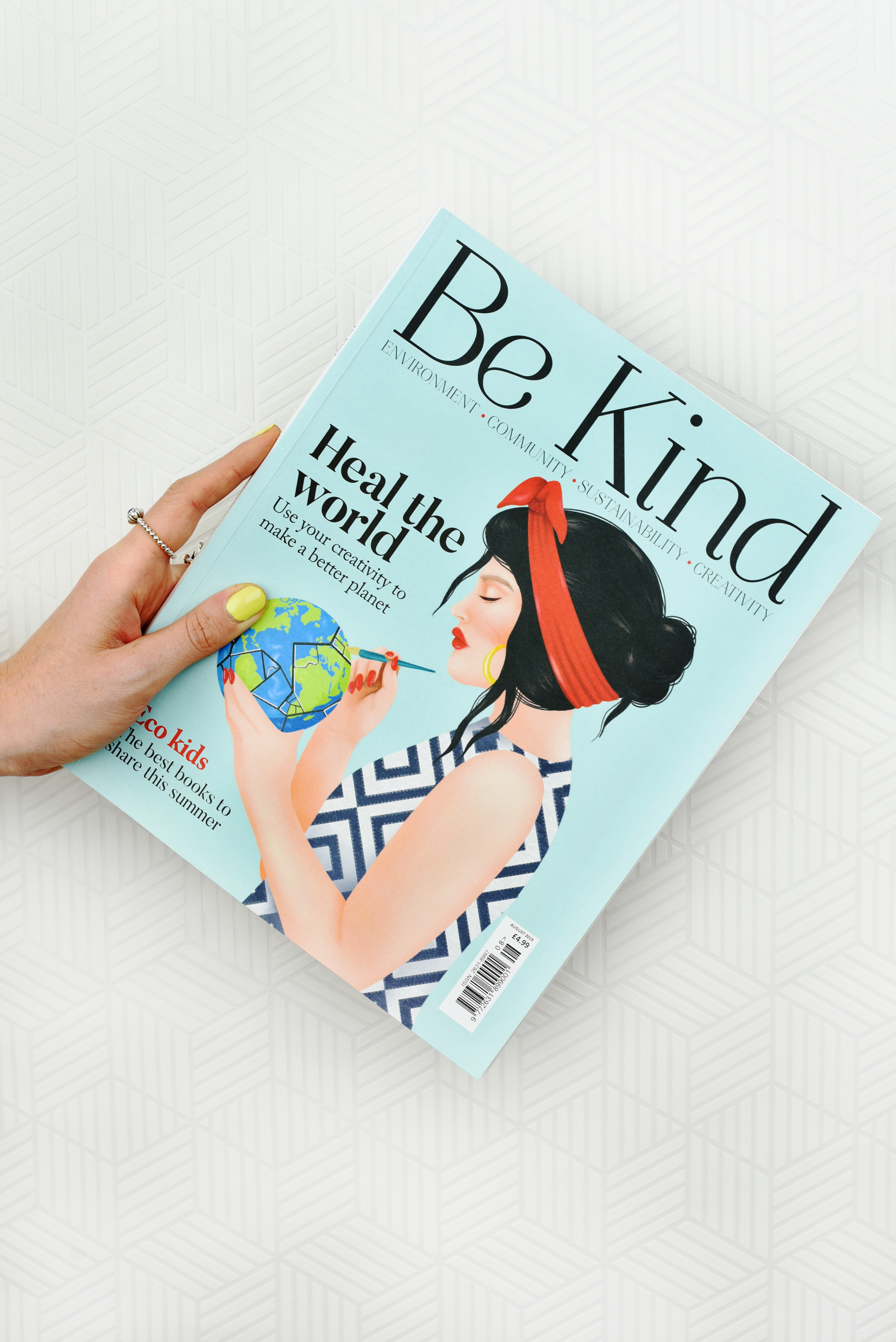
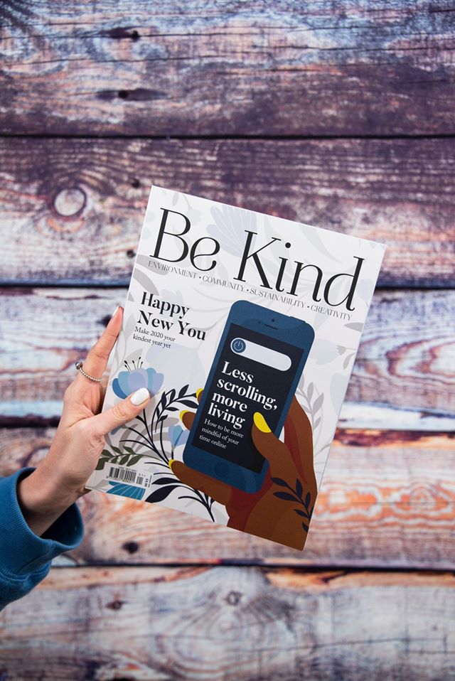
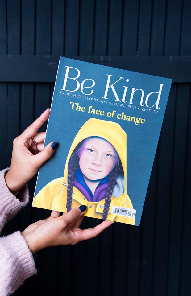
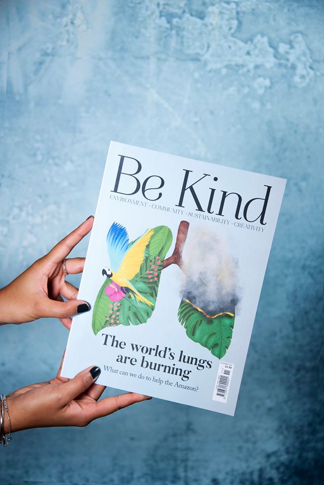
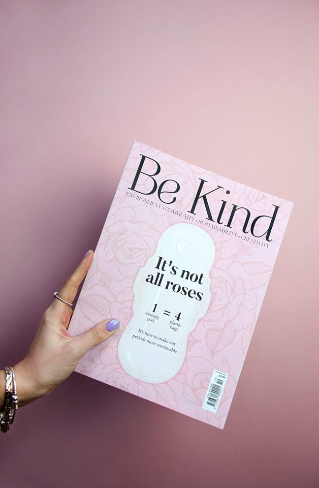
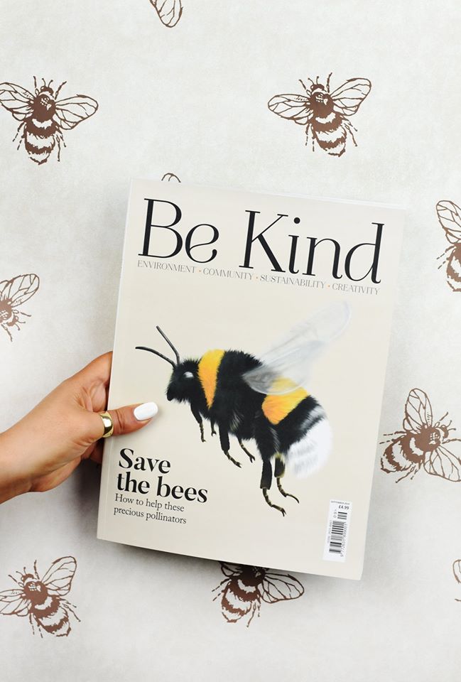
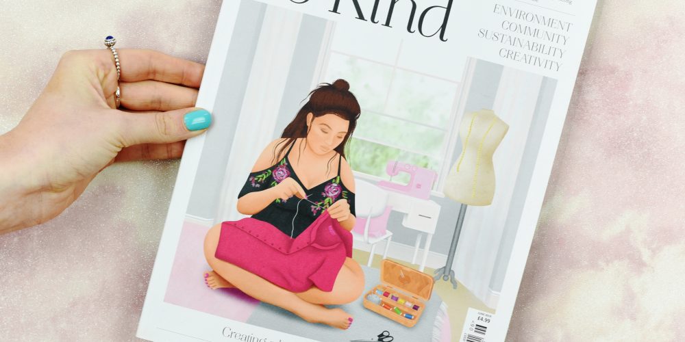
Each issue of Be Kind has it’s own overriding theme; with issue 1 being ‘plastic’, issue 2: ‘food waste’, and so on. My illustrations needed to represent the theme of each issue, whilst still maintaining a recognisable brand that regular readers would be able to spot quickly amongst the blur of brightly coloured magazines it would share a shelf with. We decided that, whilst the magazine covered a variety of serious issues, the overall feel of the mag needed to be a positive one; people who picked it up needed to feel inspired to make a change, not retreat in fear of the future that is to come.
Creating the cover of each issue involved careful planning with the publication’s editors and art directors to summarise the topics that would be included within the magazine’s pages. I was given a concise list of possible avenues I could venture down with my illustration, and given time to collate my ideas. Using Procreate on my iPad, I created a few sketches to show possible routes for the cover, before discussing each possibility with the team and figuring out which would best fit the issue. Once a design was signed off, I brought the chosen sketch to life, using a distinctive set of illustrative techniques to establish a unique style that was individual to the Be Kind brand. As Be Kind is published monthly, illustrating each cover required efficient time management and excellent communication between myself and the Be Kind team.
The solution
To date, I have illustrated the first twelve covers of Be Kind Magazine. Each one not only contributes to the collectable, ‘Instagrammable’ feel of the magazine, but also represents an important message.